
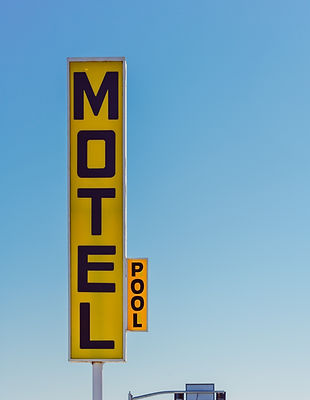
the Great Amrican Road Trip
Road trips and adventure have long been sources of imaginative fodder in America. Just look at literature and film, and you will see that images and stories of The Great American Road Trip permeate all types of media. If I tell you to picture a 'road trip,' you might imagine long winding roads, neon flashing 'no vacancy' signs, and big folding maps taking up half the windshield. But the reality for modern road trippers involves a lot more swiping their thumb on a screen and less sticking it out to hitchhike. The modern American road tripper needs fast-paced and flexible tools to keep up with their tech-savvy trips.


Planning a road trip can be a daunting experience requiring travelers to use multiple imperfect tools to solve problems as they arrive.
Project Goal
The goal I set out with this project was to create an app that put all of the tools for planning a road trip in one place. Out Yonder would incorporate the most up-to-date information on weather, traffic, and cell coverage so that travelers have an agile tool for planning safe and fun trips.
Method
Using the double diamond method of design I was able to be expansive in my scope and thinking without losing sight of the details and specificity that would make my app unique and impactful.

1. Discover
In the discovery phase of my project, I did online research to defined my problem statement and how might we question. With these as a jumping-off point I was able to conduct user interviews and analyze my findings.
Key Research Insights
I began my research by diving into facts and figures about Americans who take long road trips and the problems they have. It’s an understudied topic for how prevalent it is in American culture but I was able to uncover some interesting statistics.

⅔ of Americans plan to go on more road trips

Travelers use an average of 7 apps when planning a trip

37% percent of road trippers have had nightmare experiences on the road
Problem Statement
For Americans planning a long-haul road trip, it can be a daunting experience using less than satisfactory technology. Travelers often use 7 to 8 apps and sites, including maps and weather, when making travel arrangements. But even the most well-organized itineraries cannot foresee every problem. 37% of roadtrippers have had nightmare experiences on the road. Loss of service, blizzards, rock slides, and tornadoes are just a few of the hazards Americans who take roundtrips over 1,000 miles can encounter

Design Challenge
How might we integrate up-to-date data on weather, traffic, and cell service into the itineraries of Americans who take road trips over 1,000 miles so that they feel confident in their plan and safe when they deviate from it?
Statistics and news articles are a great place to start but in order to understand what my users needed I had to talk to some real road-tripping Americans.

Once I had finished my interviews I combed through my transcripts looking for relevant quotes I could use in my affinity map. I used this technique to find the area to focus my app on that would have the most benefit for my users.

2. Define
In the discovery phase of my project, I did online research to defined my problem statement and how might we question. With these as a jumping-off point I was able to conduct user interviews and analyze my findings.
Once I had finished my interviews I combed through my transcripts looking for relevant quotes I could use in my affinity map. I used this technique to find the area to focus my app on that would have the most benefit for my users.

Opportunities for Design Intervitions
Using Josh’s Persona I created an Experience Map and plotted out the following scenario:
As one of the last legs of his trip, Josh is driving from Nashville, TN to Shreveport, LA.
-
In the morning he checks his itinerary, it’s a lot of driving but he can do it.
-
He drives through Memphis in the early afternoon just as traffic is getting bad.
-
His GPS reroutes him but it’s a road with spotty service.
-
Josh sees that the weather is getting bad and gets a tornado warning on his phone.
-
He turns on the radio for weather updates and looks at the sky to find a safe path forward.
-
Josh arrives in Shreveport safe but hours after he has paned and is pretty shaken up.

Writing User Stories
I sat down to write 20-30 user stories based off my Persona.
A road tripper concerned about disasters and hazards on his trip wants a place where he can plan and see his whole itinerary and update it on the fly.
The format of a user story is: As a____,I want to____so that____. This structure will help me break down the actions my users need to take into their components. All my designs and flows will grow out of these building blocks.
User Stories

Chosen Story for Task Flow
As a road tripper, I want to see the impact of upcoming weather on my route so that I can adjust my itinerary and avoid hazards.

Task Flown Diagram
Taking the chosen Epic and User Story from the last part I construed a Task Flow to demonstrate how the User would move through the app. I did all of this with the goal of better understanding my users and at what point in their journey a digital solution could best serve them.

3. Develop
After narrowing down into my Task Flow Diagram it was time to expand my horizons again. I began by gathering inspiration and doing exploratory sketches until I had a refined flow. From there I made a version 1 prototype that I could start user testing on. I did multiple rounds of testing and prototyping until I had a final mid-fi version.

UI Inspiration
Before I could start sketching I needed to gather inspiration for what I wanted the look and feel of my app to be. This could be individual elements or full screens.
I brought all of it together in a collage where I could begin to narrow in on what I wanted the visual language of my app to be and what would benefit my users.

Sketching
Sketching was a multi-phase process. I started by making three rough sketches of each one of my screens, selecting one version to refine, and then arranging my final sketches into a flow.
It was important for me to get as many ideas out of my head and onto paper (even the bad ones) as possible because otherwise, my first thought would be my only solution. While sometimes I had a clear vision from the get-go often it was through the drafting process that I was able to surprise myself with creative answers.
01
Home Screen

02
Itinerary Screen


03
Weather Screen

04
Compare Routes Screen

05
Alert Popups

06
Download Popup

Using my sketches as a map I created Mid-Fi Wireframes & a Prototpe in Figma.


Welcome
With a prototype ready it was time to start my first round of user testing. With all the feedback I receive I can go back and make an improved version.
4 of my User Tests were virtual and one was in person but I made sure all my participants had the same prototype, questions, and tasks to complete. I also made screen and audio recordings of my tests to refer back to when I was analyzing my findings later.
Prototype 1.

.png)
.png)
User Testing & Iteration
Using my design Design Prioritization Matrix as a plan I began making changes to my prototype for a version 2.
My main focus for this round of changes was redesigning the weather screen, as all of my testers had issues with it to varying extents. Finishing the text was also a high priority. Additionally, I aimed to bring more attention to the alerts. I made tweaks to the formatting and flow as time allowed.
01
Home Screen


02
Itinerary Screen

03
Weather Screen


4. Deliver
This was the final step in creating my mobile app design. I made a list of evocative words and created a mood board to extract colors from. Additionally, I designed a wordmark and logo, incorporating all these elements into my final color prototype. Once I finalized all my choices, I documented everything in a UI Library.
Branding
With the structure and content of my app refined it was time to work on my Brand Development. I injected color and tone into my mobile app design through a Moodboard, Wordmark, App Icon, and logo.
I began my brand development by building a Wordmark and putting together a mood board. I focused my visual gathering by first creating a list of adjectives that described the essence of my app along with making a more A than B list.
-
More adventurous than timid
-
More fearless than worried
-
More nostalgic than modern
-
More outdoorsy than staying home
-
More unruffled than panicked
-
More mindful than surprise
-
More vivid than subdued


Accessibility


.png)

User Interface Library
The purpose of a user interface Library is to create a toolbox for future designers and Developers so they can create a consistent style going forward. Also as a designer, it’s an intense way to go over your project with a fine-toothed comb making sure that everything is made to your standards.
I will be using Atomic design to categorize the different elements of my app. First into Foundations then Atoms, Molecules, Organisms, Templates, and Screens. Each part builds off the last forming larger and more complex structures.


5. Marketing
With the Out Yonder prototype in a good place, I could begin planning a marketing strategy so people could find my app and start using it.
Product Marketing Sites
The purpose of a marketing app is to get users to download. Getting Out Yonder on people’s phones is the whole purpose and the only call to action, everything on the site should be serving this cause.
The site is designed to be a proof of concept not all of the features are currently included and the stats, reviews, and write-up are aspirational, not factual.

Sketching
I started by taking screenshots of the marketing websites for all the apps I had installed on my phone. I sorted through all my pictures to pull out the bits and pieces that I wanted to use in my marketing site. I then started sketching the web and mobile versions of my marketing site based on my inspiration.


Wireframes + Prototypes
First I need to expand on my mood board as I begin wireframing. Next, I need to make two grayscale versions of my desktop and mobile marketing website. Finally, I need to refine them into Hi-Fi versions that I can use for testing.


Testing & Solutions
Showing my prototypes to peers and testers to get their feedback. Organizing that feedback and developing a strategy for implementing it, along with any other changes I want to make. Creating the final versions of my marketing website for both desktop and mobile and showcasing the revisions I've made.


01

02


03

04


Multi-Platform Challenge
I set out to challenge myself to come up with another interface to engage with Out Yonder. Since it is designed to be a flexible on-the-go solution I wanted to focus on a device that was either mobile or already integrated into travel. I thought CarPlay was a great option.
Out Yonder for Carplay
Out Yonder is not a GPS navigation tool but it does integrate with them. If Out Yonder notifications could interact with navigation on a car screen then even a busy solo traveler (Like my persona Josh) could take advantage of up-to-date alerts and route suggestions without being distracted by his phone.


6. Design Impact & Future Thinking
In the final section of this case study, I will go over some of the possible design impacts as well as my next steps and key learnings.
Design Impact
My Out Yonder project aimed to create a comprehensive app for modern road trippers, integrating tools for weather, traffic, and cell coverage into one platform. Through a structured design process, the app evolved to address the challenges faced by long-distance travelers.
It was time to start looking to the future, what pitfalls would an app like Out Yonder have? And how would I continue to develop it in the future?
Tarot Cards of Tech
The Tarot Cards of Tech is a tool designed to facilitate discussions around the ethical implications and potential consequences of technology. Each card represents a different scenario, question, or consideration. By using these cards, teams can explore how their technologies might influence users and society, fostering more responsible and thoughtful innovation.


The Scandal
Because my app deals with weather and safety information it is of the utmost importance that all data is up to date and correct. If someone used the info provided by Out Yonder and ended up in a dangerous or life-threatening situation it would be horrible and reflect very poorly on the app.
Mother Nature
I think the environment would fire me if they were my client. My app is at the end of the day a long-distance driving app. I don’t currently have any tools or incentives having to do with sustainability or reducing one’s carbon footprint. My hope is that as car and travel technology improves there will be cleaner, and cleaner ways of exploring the USA, but for now there is nothing like exploring America from your car.


Key Learnings

.png)
It would be hard to overstate how much I have learned and grown as a designer through working on this project. At the outset, I didn’t know anything about UX design and was quite overwhelmed at the prospect of all the work I had ahead of me. But now as I look out the rearview I am incredibly proud of all my hard work and the way that Out Yonder turned out.
01
Prototyping and Testing
Working extensively with tools like Figma for wireframing and prototyping increased my technical proficiency. This skill set is essential for translating ideas into tangible, testable designs and allows for more efficient and effective design iterations.
03
Branding and Visual Identity
Developing a strong brand identity for "Out Yonder" required me to delve deeply into visual design principles, color theory, typography, and the emotional impact of visual elements. Creating a cohesive visual language involved extensive research, mood board creation, and iterative design processes. This experience honed my ability to build a compelling brand that resonates with users and stands out in the marketplace.
02
Responsive and Accessible Design
Ensuring that "Out Yonder" was accessible to all users required adhering to established accessibility standards and best practices, such as the Web Content Accessibility Guidelines (WCAG). This included ensuring sufficient color contrast and text choices.
04
Improved Problem-Solving Abilities
Addressing the complex problem of road trip planning requires creative and practical solutions. Through iterative design and testing, I developed a keen ability to identify issues and devise effective solutions, strengthening my overall problem-solving capabilities.
Next Steps
Add a general description of the items listed below. You can introduce the list and include any relevant information you want to share. Double click to edit the text.
Expand Integrated Tools
Include features like real-time gas prices, nearby attractions, and dining options.

Partnerships
Collaborate with travel service providers to offer exclusive deals and benefits.

Social Features
Allow users to share their trips and experiences to increase engagement.

Continuous User Feedback
Ensure the app evolves with user expectations and technological advancements

Advanced Technologies
Utilize AI for personalized recommendations and AR for an immersive experience.

Sustainability Features
Incorporate eco-friendly travel options and carbon footprint tracking.